
Packaging has to do fundamentally different jobs depending on the channel, since the “moment of truth” happens in different places.
Here’s how the strategy splits:
In-store (retail shelf) packaging
The core job: win a 3-second glance from 3+ feet away, next to competitors.
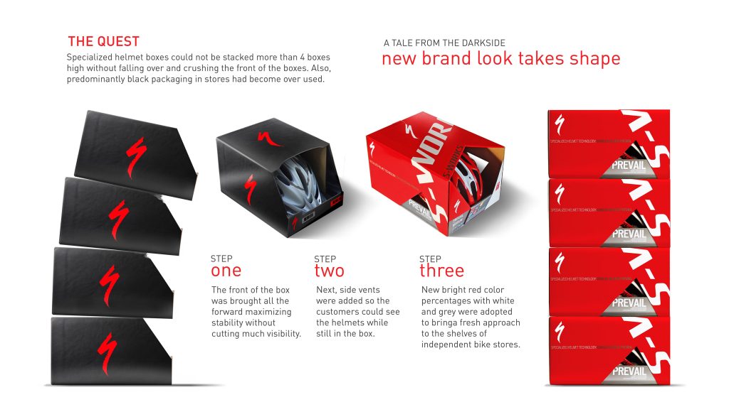
- Shelf impact over detail — bold silhouette, high-contrast color blocking, and a strong “shelf color” that reads at a distance matter more than fine typography or texture, since shoppers scan quickly.
- Physical differentiation — unusual shape, size, or material (like your stone paper texture) creates tactile stand-out when people pick it up — this is a channel advantage online can’t replicate.
- Front-facing hierarchy — assume only the front panel gets seen; put brand name, the single most persuasive claim, and visual identity there. Side/back panels can hold ingredients, instructions, fine print.
- Sensory cues work harder — texture, weight, sound (crinkle, thud), even smell through the box factor into perceived quality, since people can touch it before buying.
- Compliance-driven back panels — nutrition labels, barcodes, regulatory text often need to fit real estate constraints dictated by category regulations (food, cosmetics, etc.)
- Durability for handling — needs to survive being picked up, turned over, compared, and put back by dozens of shoppers without looking damaged.
- Standing out within a category, not as a photo — designers often forget the box will sit inches from direct competitors; design against actual competitor mockups on a shelf, not in isolation.
Online (e-commerce) packaging
The core job: perform as a photograph first, an unboxing experience second, and survive shipping third.
- Design for the thumbnail — the product photo often gets seen at 200x200px on a search results page before a full-size image. Contrast, legibility, and brand recognition need to hold up at tiny scale.
- The “hero shot” angle matters more than the whole box — most people only ever see 1-2 angles (usually front, maybe a 3/4 view). Physical retail packaging designs for 360° handling; e-commerce can concentrate all the design budget on the angle that will be photographed.
- Unboxing is the new “shelf moment” — since there’s no in-store browsing, the emotional peak shifts to opening the box at home. Interior surprises (printed inside flaps, tissue paper, thank-you cards) do the persuasion work that shelf presence used to do.
- Shippability drives structural design — packaging has to protect the product through carrier handling, which retail packaging often doesn’t need to withstand (it just needs to survive a shelf and a shopping bag). This can mean double-wall construction, void fill, or entirely separate shipping boxes outside the retail box.
- No fighting for attention next to competitors on a shelf — but you are fighting for attention in a scroll feed or search grid, so thumbnail contrast and instant brand recognizability replace “shelf color theory.”
- Social shareability is a KPI — a satisfying unboxing often gets filmed/posted; increasingly, packaging is designed with an eye toward how it performs on camera, not just in hand.
- Less real estate pressure for legal copy — since product detail pages online can carry ingredients/instructions digitally, physical panels can be freed up for pure brand storytelling.
If you’re designing one packaging system for both
A few reconciling strategies:
- We design the front panel for both distances — bold enough for a shelf, legible enough as a thumbnail.
- We can separate the “protective” layer from the “brand” layer — a plain, sturdy shipping box outside, with the branded retail box safely inside — common with beauty and food brands that sell in both channels.
- Keep interior surprises reserved for online orders — retail customers don’t experience “opening” the same way, so unboxing details are often wasted budget for shelf-bought product, but high-ROI for e-commerce.

